2023
Background
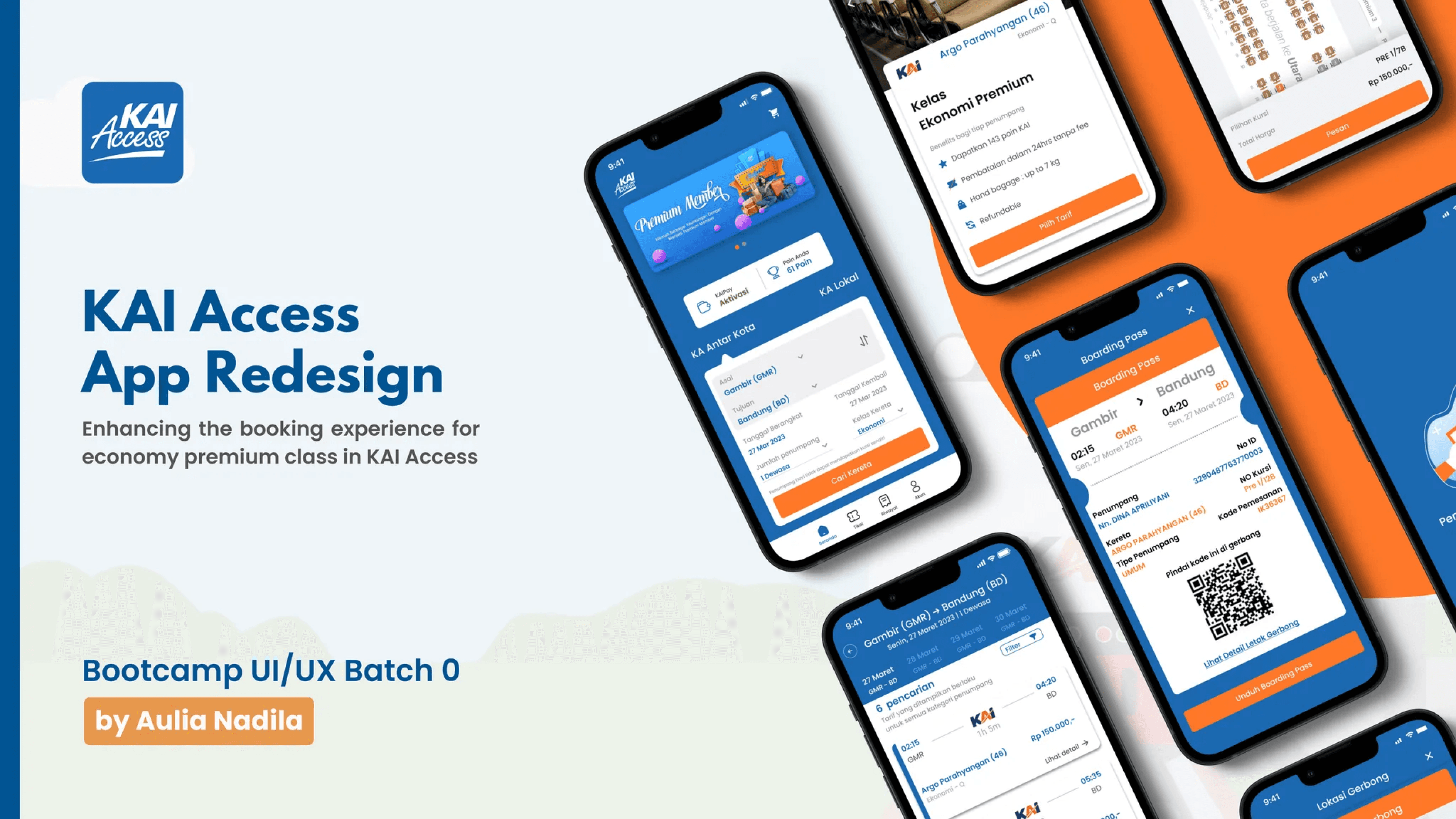
KAI Access is the official mobile application for PT Kereta Api Indonesia, providing ticket sales and additional features such as cancellations, rescheduling, e-boarding passes, and more.
This project was created as part of a mini bootcamp led by Kak Aulia Nadila. As the team leader, I ensured that our team stayed on track throughout the research, design, and testing phases.
Duration: 1 month (May - June 2023)
Role: UI Designer & Team Leader
Core problem
Our focus was on improving the user experience for economy premium class ticket purchases. Through user research, we identified key pain points in the existing booking flow, including:
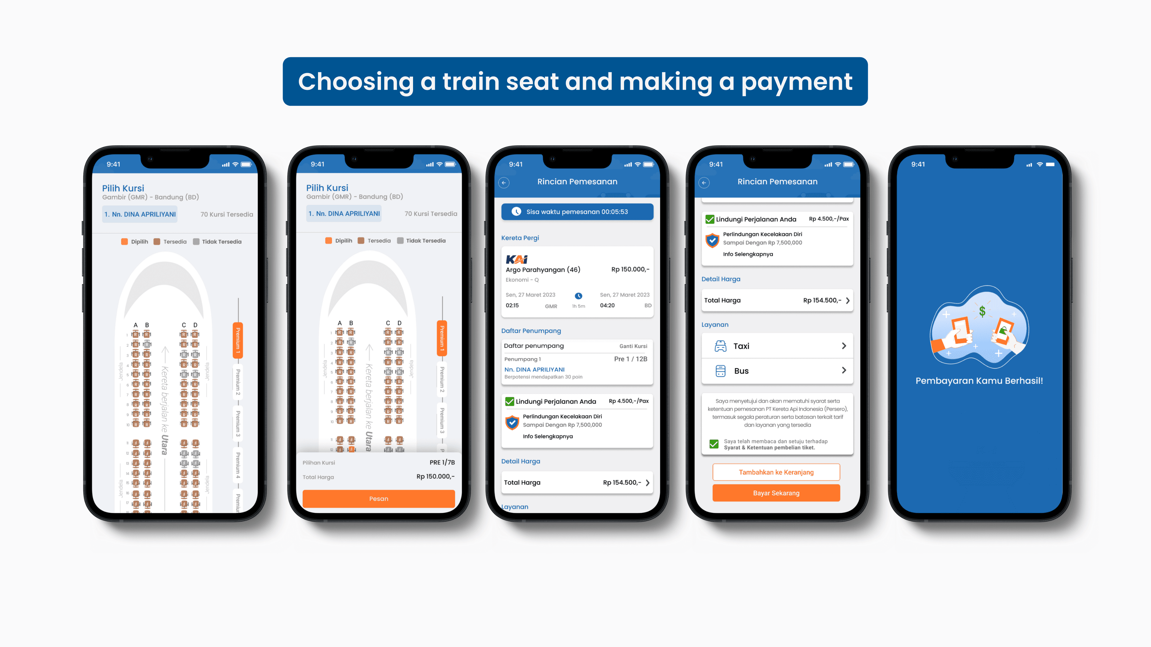
Lack of detailed seat selection information.
No indication of seat orientation relative to train direction.
Missing subclass code information.
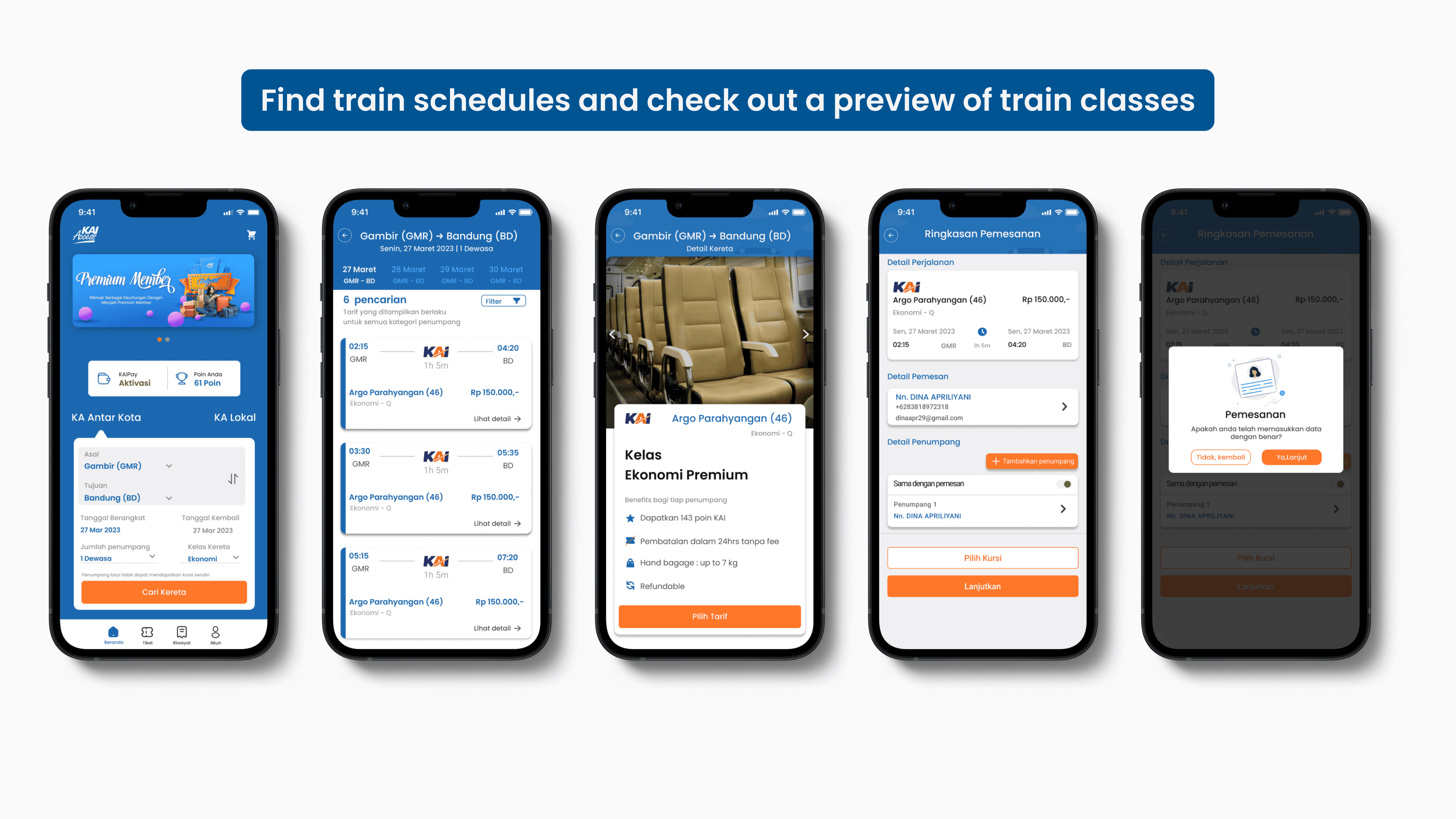
Confusing train class selection process.
With a limited timeline, we prioritized addressing one critical issue to enhance usability.
User Research & Key Insights
To understand user pain points, we conducted interviews with five KAI Access users (ages 18-25) who had used the app for 3-6 months. We then used an affinity diagram to organize qualitative data, categorizing insights into positive experiences and major concerns.
Design Process
We approached the problem using the How Might We (HMW) framework to guide solution development. The key phases of our design process included:
User Flow – Mapping out the ticket booking process to improve clarity and navigation.
Wireframing – Sketching low-fidelity wireframes in Figma based on user research findings.
High-Fidelity Design – Creating a visually refined UI that aligns with the KAI brand identity.
UX Writing – Crafting a clear, informative, and professional tone to enhance the booking experience.
Results and Impact
To validate our design, we conducted usability testing with two users via Maze. The feedback revealed:
✅ Users appreciated the new seat selection interface, which clearly displayed seat orientations.
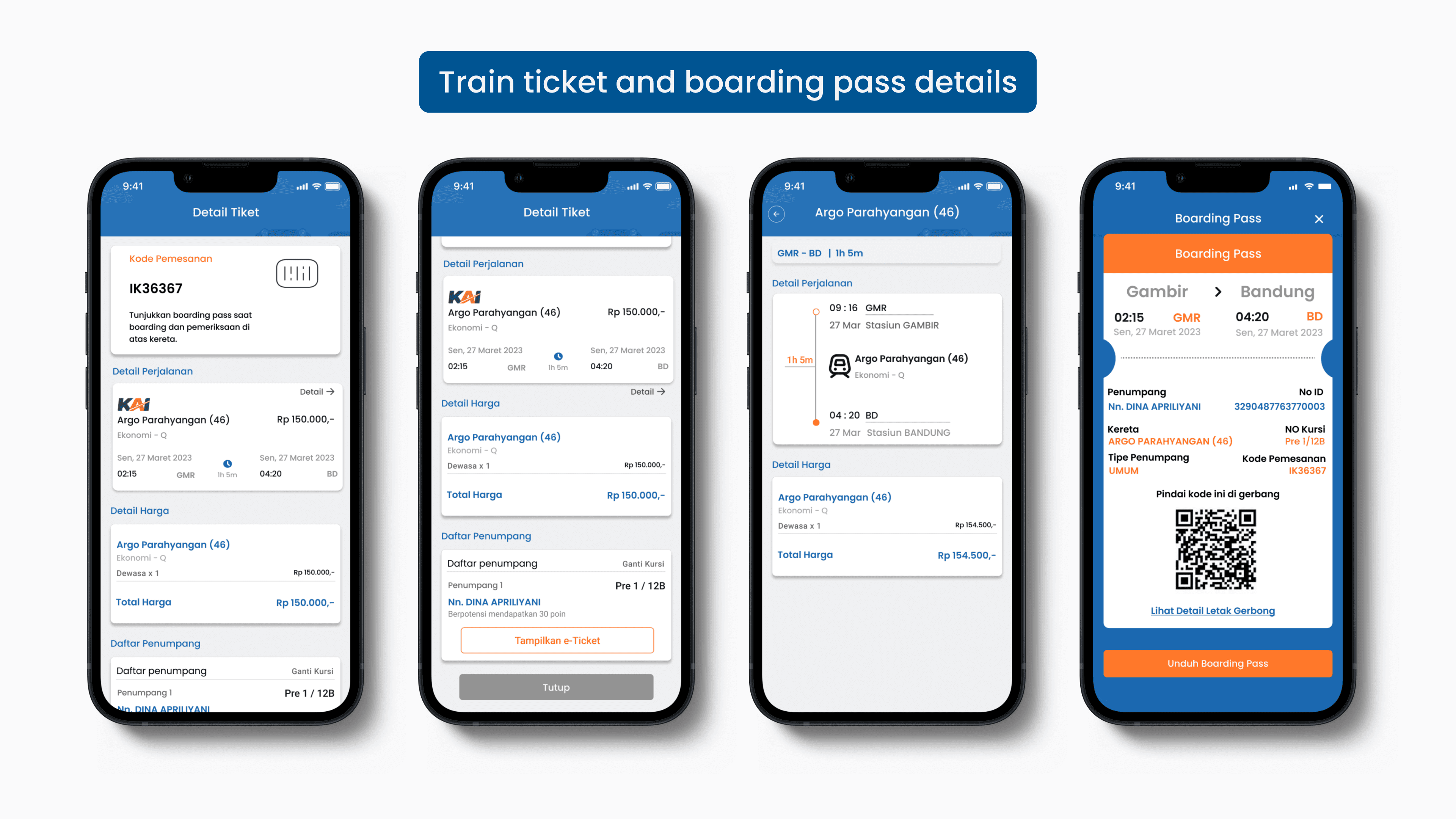
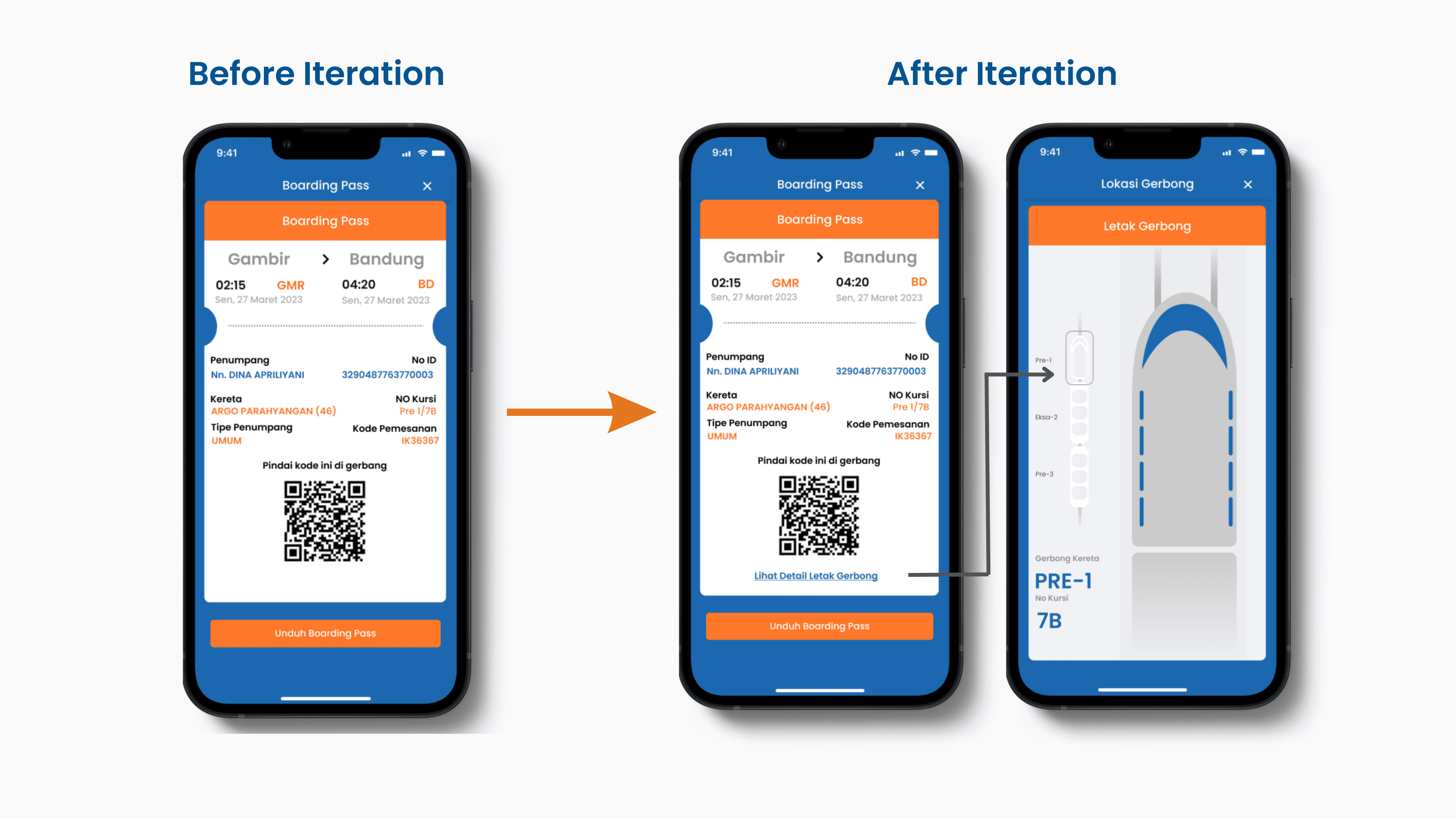
⚠️ Some users still found it difficult to locate their assigned train gate.
Iteration & Final Improvements
Before → Unclear gate location on the boarding pass.
After → Added visual cues and a map-like guide to improve navigation.
This project helped us understand the importance of early user feedback, iterative design, and balancing usability with branding. Our team was honored to receive the "Best Team" award, making this experience both rewarding and insightful.
