2024
Visiku
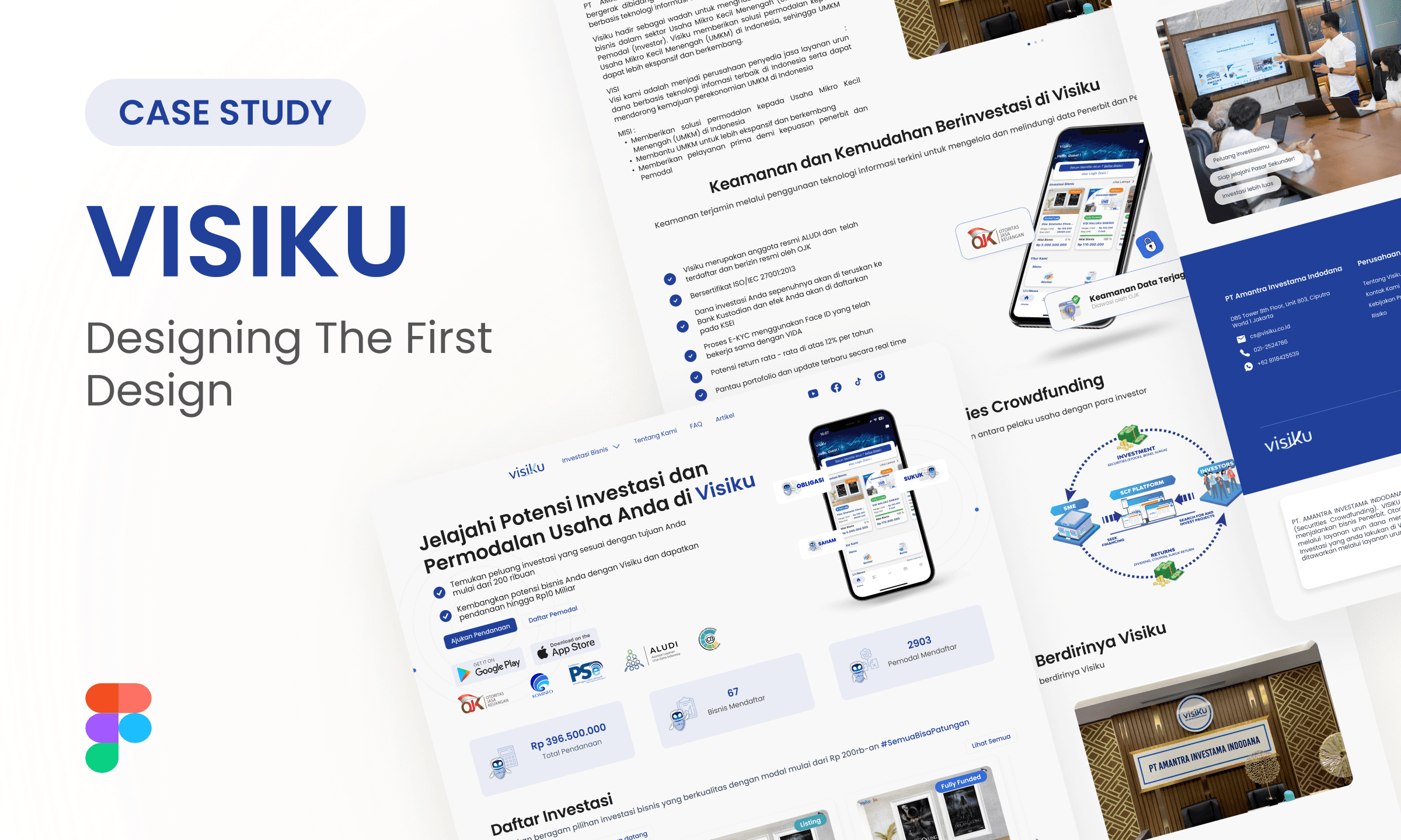
Full Case Study
Background
Visiku is a Securities Crowdfunding platform that connects Micro, Small, and Medium Enterprises (MSMEs) with investors, providing funding solutions to help businesses in Indonesia grow. As an official member of ALUDI and licensed by OJK, Visiku ensures a secure and regulated platform for all stakeholders.
Core problem
The previous Visiku website had several challenges impacting user experience and credibility:
Confusing Navigation: Difficult to find key pages like investment opportunities and company details.
Outdated Visuals: Mostly text-based, lacked engagement.
Absence of Trust Signals: No testimonials or proof of credibility.
Weak CTAs: Ineffective at driving sign-ups and investment exploration.
Poor User Flow: Lacked clarity on different types of funding.
Brand Identity Inconsistency: Did not reflect Visiku’s youthful, modern image.
Goals
Through discussions and analysis, we aligned our goals into two key areas:
Business Positioning: Establish credibility, brand awareness, and industry leadership.
Usability & Engagement: Enhance navigation, trust, visuals, and conversions.
Redesign Strategy
Build Trust & Credibility: Show Visiku as a professional, OJK-licensed platform with social proof and transparent information.
Improve User Experience: Enhance navigation, clarify investment opportunities, and create a seamless flow.
Strengthen Brand Identity: Align the design with Visiku’s modern vision while maintaining industry standards.
Increase Conversions: Optimize CTAs and highlight key offerings to drive sign-ups and investor participation.
Key Improvements
Navigation & Usability Enhancements
Simplified the site structure for intuitive browsing.
Added clear CTAs to guide users effectively.
Introduced a sitemap to streamline page access.
Visual Redesign
Adopted a clean UI with blue and white color schemes to convey trust and professionalism.
Introduced Poppins typography for modern readability.
Integrated custom illustrations and a futuristic mascot to enhance brand personality.
Trust & Engagement Features
Added testimonials and investor success stories.
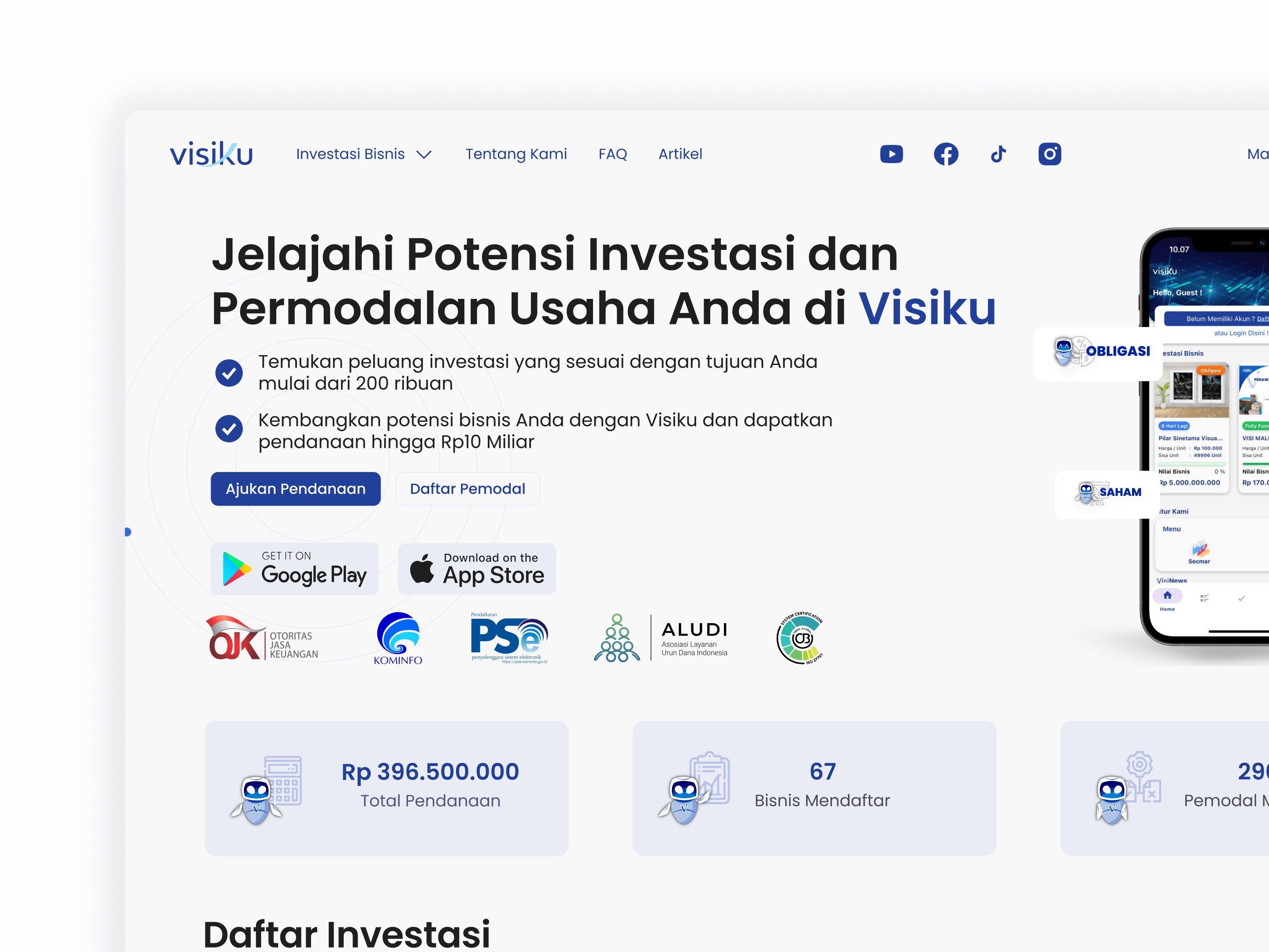
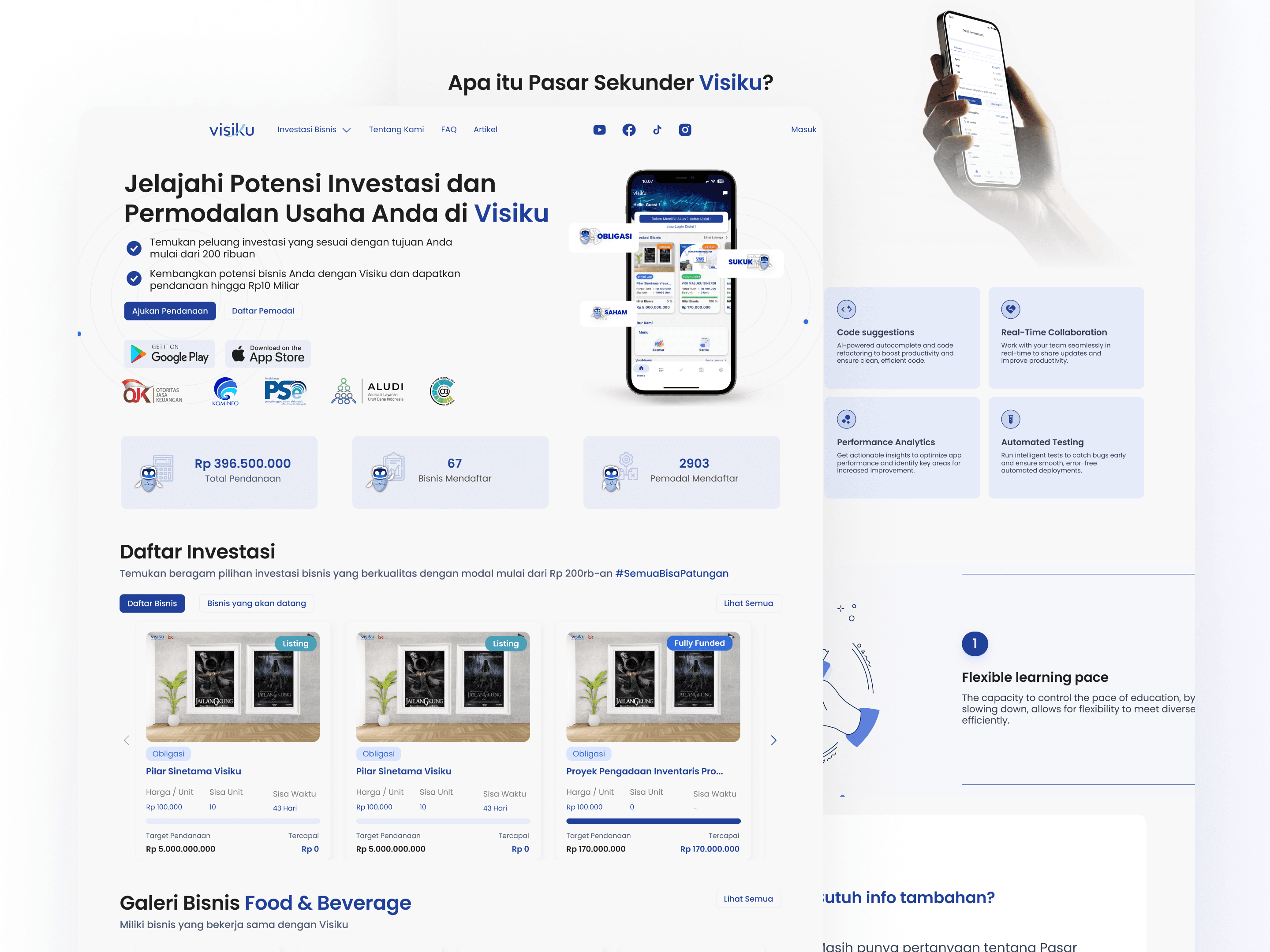
Highlighted OJK, ALUDI, PSE, and ISO 27001 certifications.
Developed an investment simulation tool to help users visualize returns.
Implemented media coverage and partnership showcase with dynamic effects.
Before & After RedesignHomepage:
Before: Weak branding, blocky layout, lack of trust indicators.
After: Stronger identity, improved hero section, visible credibility logos.
Investment Listings:
Before: No descriptions, no filters, no "See More" button.
After: Clear descriptions, filtering options, and detailed pages.
USP & Investment Simulation:
Before: No clear unique selling proposition, no way to estimate returns.
After: Defined USP section and interactive investment calculator.
VISINews & VISITalks:
Before: Cluttered news layout, lack of content structure.
After: Organized design with filters and clearer CTAs.
Testimonials & Partnerships:
Before: No testimonials, static partner logos.
After: Real user feedback, animated logos for credibility.
Results and Impact
Key Takeaways & Future Improvements
Increased trust with testimonials and investment simulation.
Improved navigation and engagement through structured redesign.
Next steps: Explore more personalization for different user types.
Design new features to further enhance the user experience.
The redesign successfully aligned Visiku’s digital presence with its mission—offering a modern, engaging, and trustworthy investment platform.


